
Search…
Search…
Dialog
Live in Codebase
Checkboxes let users pick one or multiple options; if only one choice is allowed, use radio buttons or a drop-down. Checkboxes usually need an explicit submit action, while switches apply changes immediately.
AA
WCAG 2.1 accessibility compliant
Dialog
Live in Codebase
Checkboxes let users pick one or multiple options; if only one choice is allowed, use radio buttons or a drop-down. Checkboxes usually need an explicit submit action, while switches apply changes immediately.
AA
WCAG 2.1 accessibility compliant
Dialog
Checkboxes let users pick one or multiple options; if only one choice is allowed, use radio buttons or a drop-down. Checkboxes usually need an explicit submit action, while switches apply changes immediately.
View Figma Designs

View Figma Designs
View Figma Designs
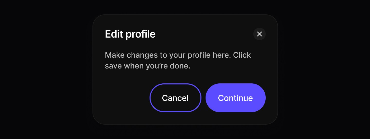
Basic Dialog
Modal dialogs for important actions and content overlays.
When to use | When not to use |
|---|---|
✅ Use for confirmations and conditional changes | ⛔️ Avoid for nonessential information unrelated to the current flow. |
✅ Trigger when user action is required. | ⛔️ Don’t use if the user needs extra information that isn’t available within the modal. |
✅ Present content that must temporarily block interaction with the main view. | ⛔️ Never stack one modal on top of another. |
✅ Ask for confirmation before continuing a process. | |
✅ Deliver important warnings that help prevent or fix critical errors. |
Anatomy
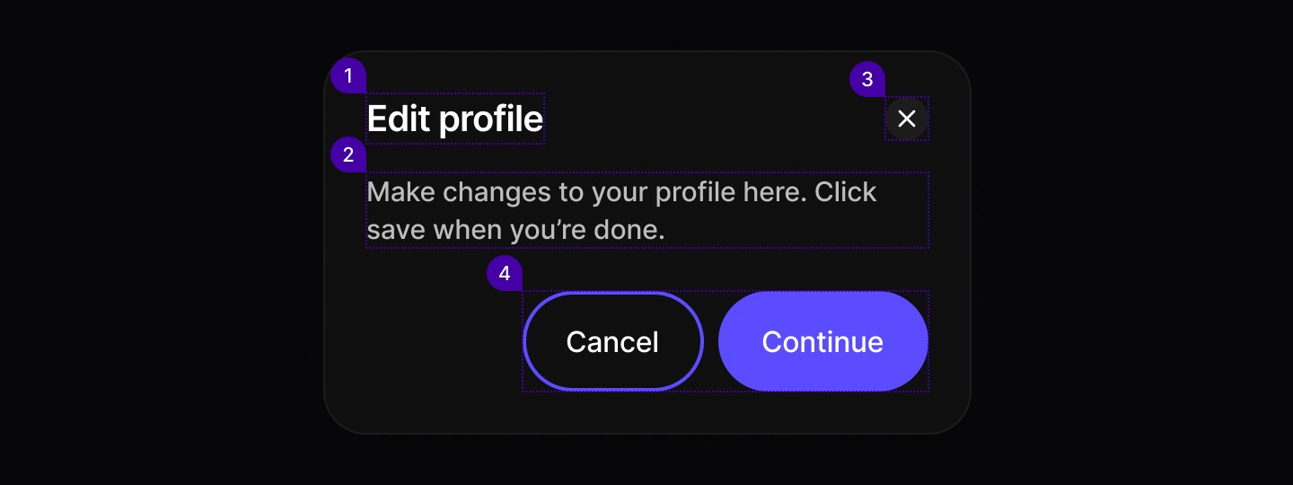
Element | Description |
|---|---|
| Text |
| Text |
| Button component |
| Secondary / Primary button components |
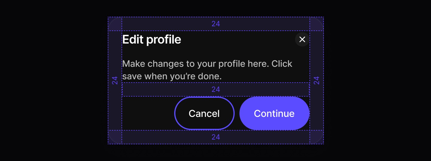
Spacing
Alert Dialog
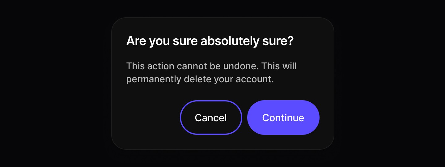
When to use | When not to use |
|---|---|
✅ Use for confirmations and unconditional changes | ⛔️ Avoid for nonessential information unrelated to the current flow. |
✅ Trigger when user action is required. | ⛔️ Don’t use if the user needs extra information that isn’t available within the modal. |
✅ Present content that must temporarily block interaction with the main view. | ⛔️ Never stack one modal on top of another. |
✅ Ask for confirmation before continuing a process. | |
✅ Deliver important warnings that help prevent or fix critical errors. |
Anatomy

Element | Description |
|---|---|
| Text |
| Text |
| Secondary / Primary button components |
Spacing

Basic Dialog
Modal dialogs for important actions and content overlays.
When to use | When not to use |
|---|---|
✅ Use for confirmations and conditional changes | ⛔️ Avoid for nonessential information unrelated to the current flow. |
✅ Trigger when user action is required. | ⛔️ Don’t use if the user needs extra information that isn’t available within the modal. |
✅ Present content that must temporarily block interaction with the main view. | ⛔️ Never stack one modal on top of another. |
✅ Ask for confirmation before continuing a process. | |
✅ Deliver important warnings that help prevent or fix critical errors. |
Anatomy
Element | Description |
|---|---|
| Text |
| Text |
| Button component |
| Secondary / Primary button components |
Spacing
Alert Dialog
When to use | When not to use |
|---|---|
✅ Use for confirmations and unconditional changes | ⛔️ Avoid for nonessential information unrelated to the current flow. |
✅ Trigger when user action is required. | ⛔️ Don’t use if the user needs extra information that isn’t available within the modal. |
✅ Present content that must temporarily block interaction with the main view. | ⛔️ Never stack one modal on top of another. |
✅ Ask for confirmation before continuing a process. | |
✅ Deliver important warnings that help prevent or fix critical errors. |
Anatomy
Element | Description |
|---|---|
| Text |
| Text |
| Secondary / Primary button components |
Spacing
Continue reading
Get in touch
Got a project in mind? Let’s chat. I’m always keen to hear about new ideas, collaborations, or challenges you’re looking to solve. Drop me a message and we can explore how to bring your vision to life together.
Get in touch
Got a project in mind? Let’s chat. I’m always keen to hear about new ideas, collaborations, or challenges you’re looking to solve. Drop me a message and we can explore how to bring your vision to life together.
Get in touch
Got a project in mind? Let’s chat. I’m always keen to hear about new ideas, collaborations, or challenges you’re looking to solve. Drop me a message and we can explore how to bring your vision to life together.