
Search…
Search…
Text Input
Live
Text inputs allow people to enter and edit freeform information, such as names, email addresses or search queries. They should be clearly labelled, provide helpful placeholders or hints where needed.
AA
WCAG 2.1 accessibility compliant
Text Input
Live
Text inputs allow people to enter and edit freeform information, such as names, email addresses or search queries. They should be clearly labelled, provide helpful placeholders or hints where needed.
AA
WCAG 2.1 accessibility compliant
Text Input
Text inputs allow people to enter and edit freeform information, such as names, email addresses or search queries. They should be clearly labelled, provide helpful placeholders or hints where needed.
Live in Storybook

Live in Storybook
Live in Storybook
Figma Designs

Figma Designs
Figma Designs

When to use | When not to use |
|---|---|
✅ Use for short text input fields | ⛔️ Use for long-form text |
✅ Provide help text and placeholder text for non-critical guidance | ⛔️ Rely on placeholder text for required information, use hint text for that purpose |
✅Validate input once the user has finished interacting, not before |
Anatomy

Element | Description |
|---|---|
| Text Input label |
| Text Input status message |
| Text Input value |
Placeholder Text
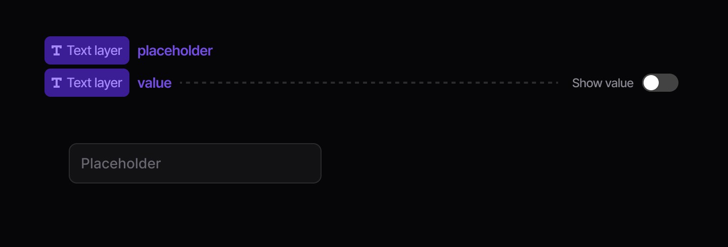
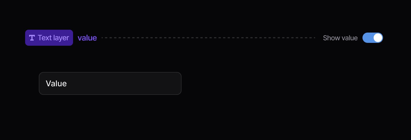
Value
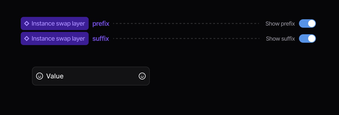
Icon Left / Right
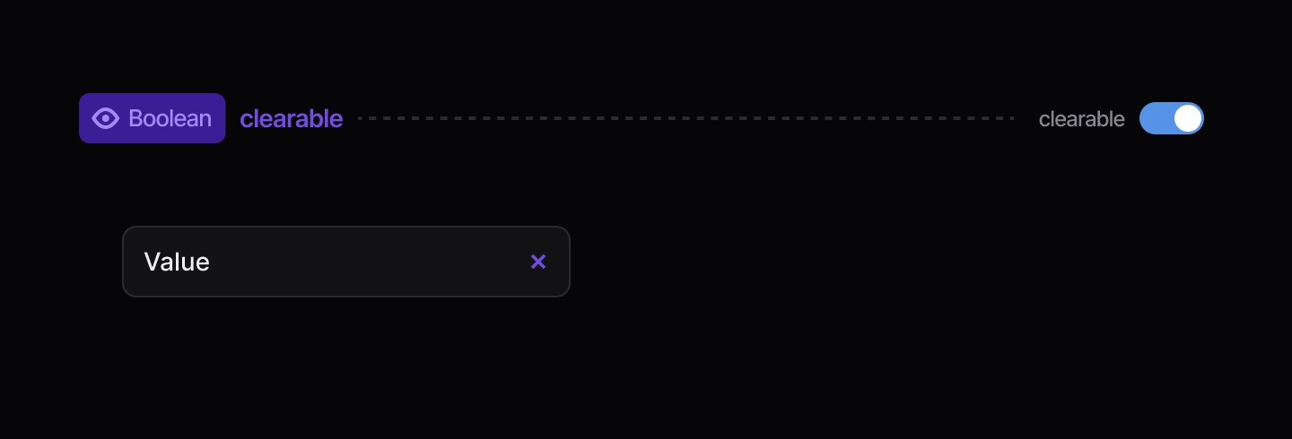
Clear Button
Status Message
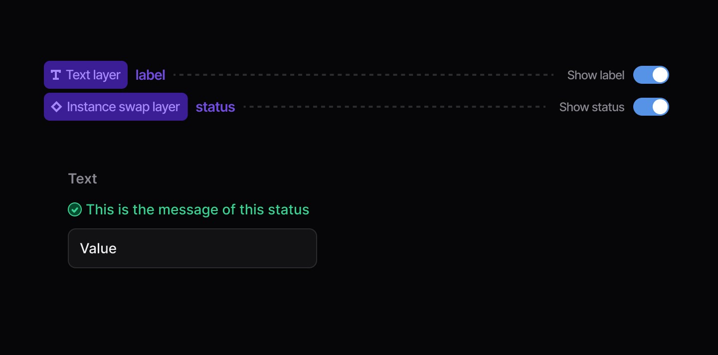
Disabled
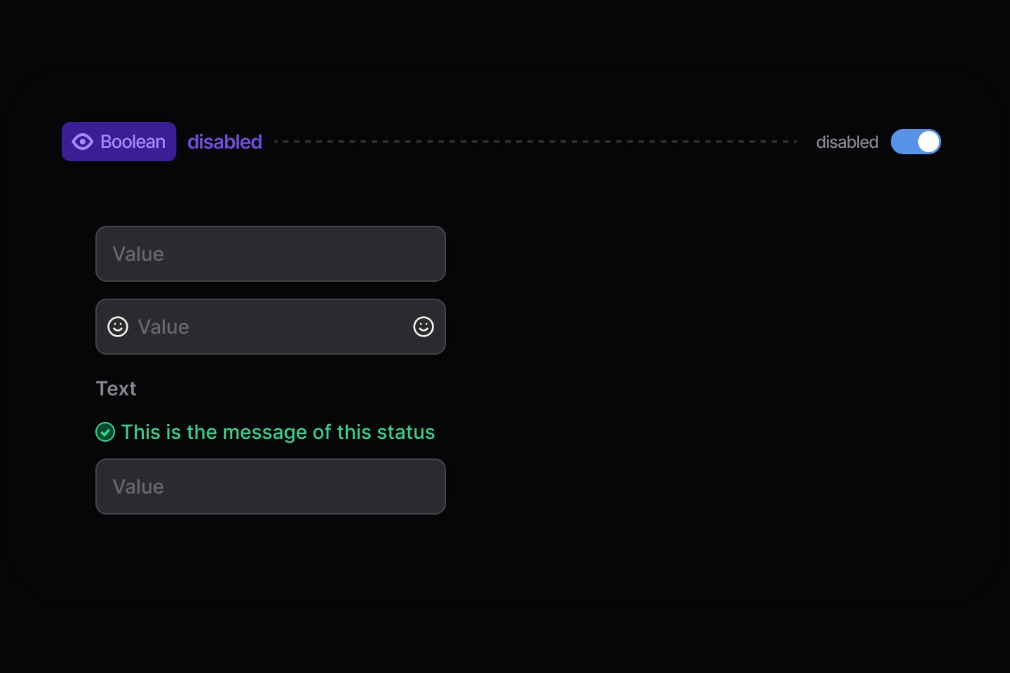
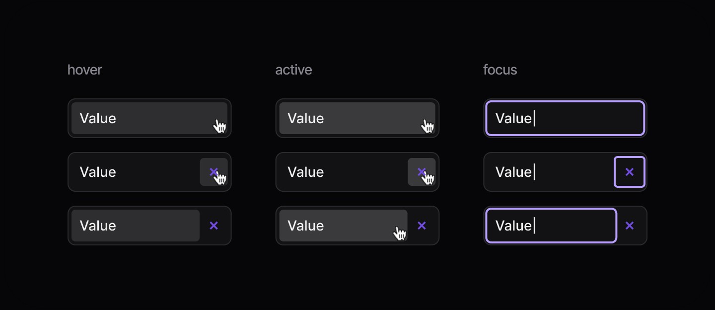
States
When to use | When not to use |
|---|---|
✅ Use for short text input fields | ⛔️ Use for long-form text |
✅ Provide help text and placeholder text for non-critical guidance | ⛔️ Rely on placeholder text for required information, use hint text for that purpose |
✅Validate input once the user has finished interacting, not before |
Anatomy
Element | Description |
|---|---|
| Text Input label |
| Text Input status message |
| Text Input value |
Placeholder Text
Value
Icon Left / Right
Clear Button
Status Message
Disabled
States
Continue reading
Get in touch
Got a project in mind? Let’s chat. I’m always keen to hear about new ideas, collaborations, or challenges you’re looking to solve. Drop me a message and we can explore how to bring your vision to life together.
Get in touch
Got a project in mind? Let’s chat. I’m always keen to hear about new ideas, collaborations, or challenges you’re looking to solve. Drop me a message and we can explore how to bring your vision to life together.
Get in touch
Got a project in mind? Let’s chat. I’m always keen to hear about new ideas, collaborations, or challenges you’re looking to solve. Drop me a message and we can explore how to bring your vision to life together.