
Search…
Search…
Switch
Live
Use a switch to let people choose between two opposing values, especially when the action has an immediate effect. Provide clear context or labels when needed. Because a switch carries more visual weight than a checkbox, reserve it for significant functionality and avoid using it for minor settings.
AA
WCAG 2.1 accessibility compliant
Switch
Use a switch to let people choose between two opposing values, especially when the action has an immediate effect. Provide clear context or labels when needed. Because a switch carries more visual weight than a checkbox, reserve it for significant functionality and avoid using it for minor settings.
Live in Storybook

Live in Storybook
Live in Storybook
Figma Designs

Figma Designs
Figma Designs

Use a switch to toggle a single item on or off when it takes immediate effect. Don't use a switch to select a single item from a list of options.
When to use | When not to use |
|---|---|
✅ Do use a segmented control instead of a switch when the options are not binary (yes/no). | ⛔️ Don't use a switch if the options aren't Yes/No, On/Off. |
✅ Use clear, descriptive labels | ⛔️ Missing or unclear labels |
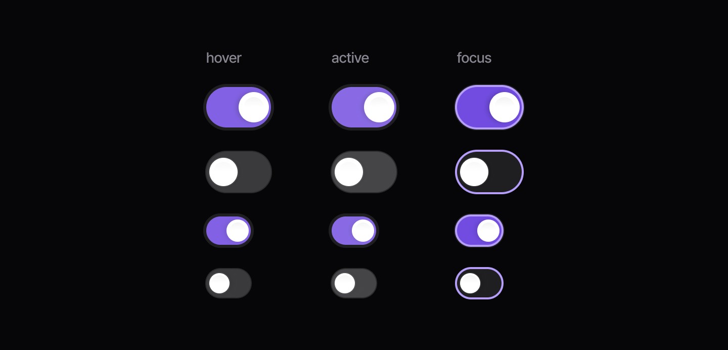
States
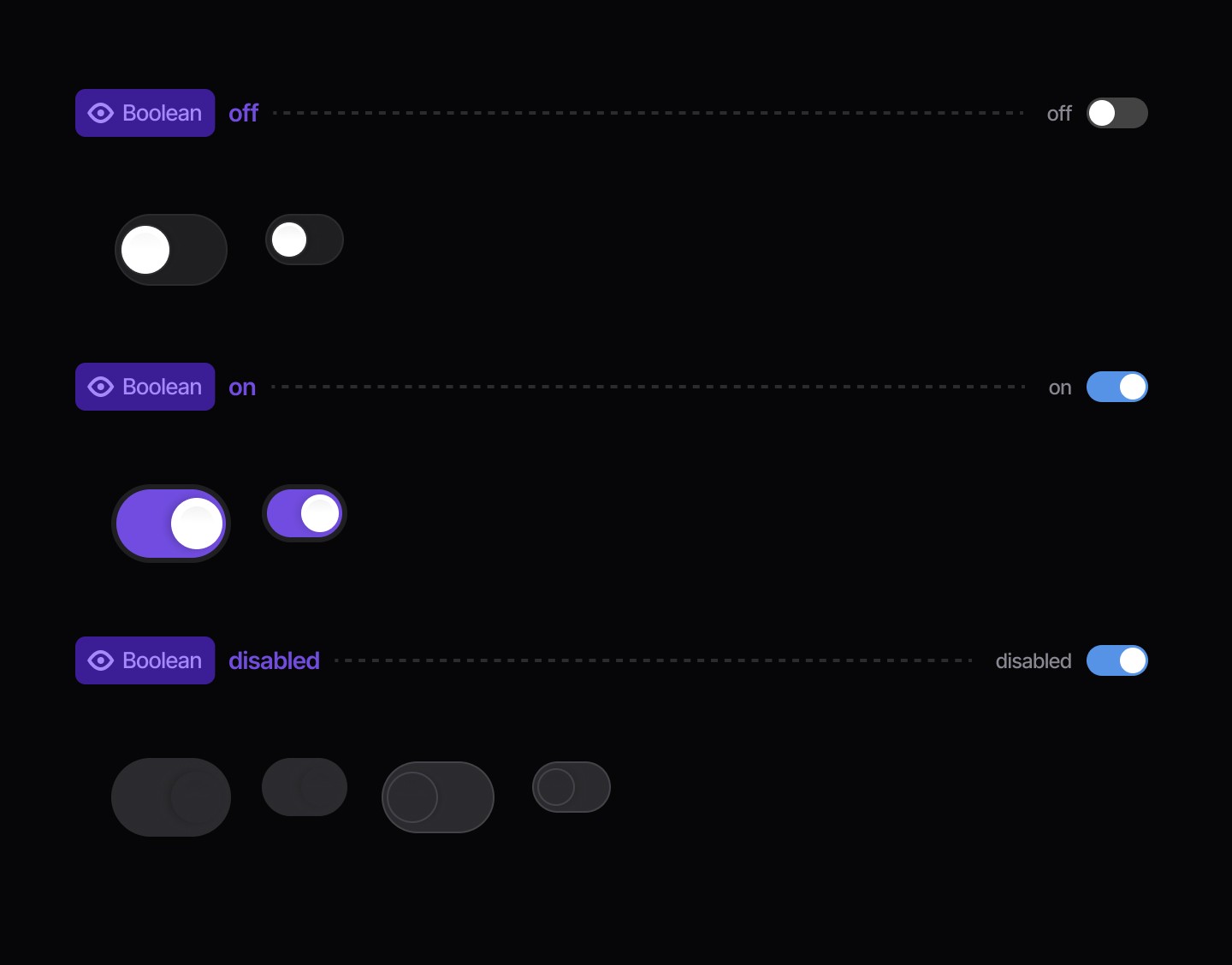
Booleans
Use a switch to toggle a single item on or off when it takes immediate effect. Don't use a switch to select a single item from a list of options.
When to use | When not to use |
|---|---|
✅ Do use a segmented control instead of a switch when the options are not binary (yes/no). | ⛔️ Don't use a switch if the options aren't Yes/No, On/Off. |
✅ Use clear, descriptive labels | ⛔️ Missing or unclear labels |
States
Booleans
Continue reading
Get in touch
Got a project in mind? Let’s chat. I’m always keen to hear about new ideas, collaborations, or challenges you’re looking to solve. Drop me a message and we can explore how to bring your vision to life together.
Get in touch
Got a project in mind? Let’s chat. I’m always keen to hear about new ideas, collaborations, or challenges you’re looking to solve. Drop me a message and we can explore how to bring your vision to life together.
Get in touch
Got a project in mind? Let’s chat. I’m always keen to hear about new ideas, collaborations, or challenges you’re looking to solve. Drop me a message and we can explore how to bring your vision to life together.