
Search…
Search…
Checkbox
Live
Checkboxes let users pick one or multiple options; if only one choice is allowed, use radio buttons or a drop-down. Checkboxes usually need an explicit submit action, while switches apply changes immediately.
AA
WCAG 2.1 accessibility compliant
Checkbox
Live
Checkboxes let users pick one or multiple options; if only one choice is allowed, use radio buttons or a drop-down. Checkboxes usually need an explicit submit action, while switches apply changes immediately.
AA
WCAG 2.1 accessibility compliant
Checkbox
Checkboxes let users pick one or multiple options; if only one choice is allowed, use radio buttons or a drop-down. Checkboxes usually need an explicit submit action, while switches apply changes immediately.
Live in Storybook

Live in Storybook
Live in Storybook
View Figma Designs

View Figma Designs
View Figma Designs

When to use | When not to use |
|---|---|
✅ Use checkboxes to let users choose one or more items from a small set. | ⛔️ Avoid using checkboxes when there are more than around 8–10 options; prefer multi-selects. |
✅ Use them for consent actions such as “Accept terms” and similar acknowledgements. | ⛔️ Do not make one checkbox change another’s state, except for “select all / deselect all” control. |
✅ Use them in forms to toggle features that require an explicit submit or confirmation. | ⛔️ Avoid checkboxes when changes should apply instantly, use a switch for real-time toggles. |
Anatomy

Element | Description |
|---|---|
| Checkbox component |
| Label text of the checkbox component |
Disabled

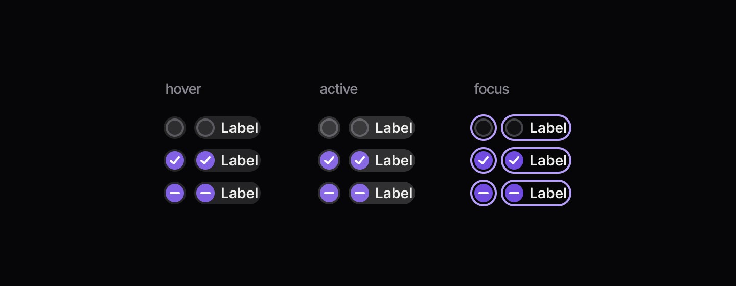
States
When to use | When not to use |
|---|---|
✅ Use checkboxes to let users choose one or more items from a small set. | ⛔️ Avoid using checkboxes when there are more than around 8–10 options; prefer multi-selects. |
✅ Use them for consent actions such as “Accept terms” and similar acknowledgements. | ⛔️ Do not make one checkbox change another’s state, except for “select all / deselect all” control. |
✅ Use them in forms to toggle features that require an explicit submit or confirmation. | ⛔️ Avoid checkboxes when changes should apply instantly, use a switch for real-time toggles. |
Anatomy
Element | Description |
|---|---|
| Checkbox component |
| Label text of the checkbox component |
Disabled
States
Continue reading
Get in touch
Got a project in mind? Let’s chat. I’m always keen to hear about new ideas, collaborations, or challenges you’re looking to solve. Drop me a message and we can explore how to bring your vision to life together.
Get in touch
Got a project in mind? Let’s chat. I’m always keen to hear about new ideas, collaborations, or challenges you’re looking to solve. Drop me a message and we can explore how to bring your vision to life together.
Get in touch
Got a project in mind? Let’s chat. I’m always keen to hear about new ideas, collaborations, or challenges you’re looking to solve. Drop me a message and we can explore how to bring your vision to life together.