
Search…
Search…
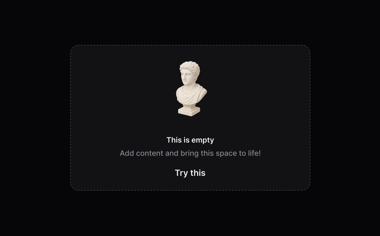
Empty State
Live
Empty states are used when there is no data to display, offering explanation and guidance to help users understand what to do next and how to make progress.
AA
WCAG 2.1 accessibility compliant
Empty State
Live
Empty states are used when there is no data to display, offering explanation and guidance to help users understand what to do next and how to make progress.
AA
WCAG 2.1 accessibility compliant
Empty State
Empty states are used when there is no data to display, offering explanation and guidance to help users understand what to do next and how to make progress.
Live in Storybook

Live in Storybook
Live in Storybook
View Figma Designs

View Figma Designs
View Figma Designs
When to use | When not to use |
|---|---|
✅ Use when another component or part of the UI has no items or data to show | ⛔️ Use as a generic banner to highlight specific content |
✅ Help users by clearly explaining the benefit and utility of a product or feature | ⛔️ Do not write sentences in title case, use sentence case. The first word should be capitalised and the rest lowercase (unless a proper noun): |
✅ Be encouraging with the content | ⛔️ Never make users feel unsuccessful or guilty |
Anatomy
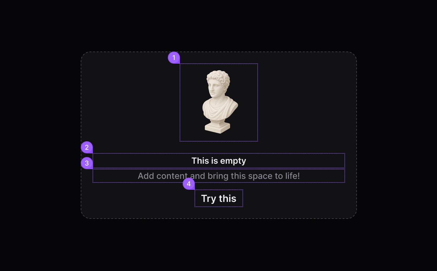
Element | Description |
|---|---|
| dsIllustration component |
| Title Label text of the empty component |
| Content text of the empty component |
| Tertiary Button |
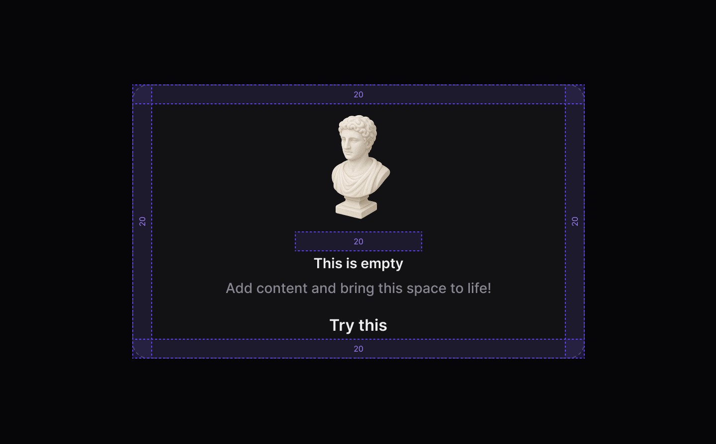
Spacing
When to use | When not to use |
|---|---|
✅ Use when another component or part of the UI has no items or data to show | ⛔️ Use as a generic banner to highlight specific content |
✅ Help users by clearly explaining the benefit and utility of a product or feature | ⛔️ Do not write sentences in title case, use sentence case. The first word should be capitalised and the rest lowercase (unless a proper noun): |
✅ Be encouraging with the content | ⛔️ Never make users feel unsuccessful or guilty |
Anatomy
Element | Description |
|---|---|
| dsIllustration component |
| Title Label text of the empty component |
| Content text of the empty component |
| Tertiary Button |
Spacing
Continue reading
Get in touch
Got a project in mind? Let’s chat. I’m always keen to hear about new ideas, collaborations, or challenges you’re looking to solve. Drop me a message and we can explore how to bring your vision to life together.
Get in touch
Got a project in mind? Let’s chat. I’m always keen to hear about new ideas, collaborations, or challenges you’re looking to solve. Drop me a message and we can explore how to bring your vision to life together.
Get in touch
Got a project in mind? Let’s chat. I’m always keen to hear about new ideas, collaborations, or challenges you’re looking to solve. Drop me a message and we can explore how to bring your vision to life together.