
Search…
Search…
Select
Live
Select allows users to choose one or multiple values from a set of options. For five or more choices, consider a Select. For shorter lists, radios or checkboxes keep the interface clearer and more accessible.
AA
WCAG 2.1 accessibility compliant
Select
Live
Select allows users to choose one or multiple values from a set of options. For five or more choices, consider a Select. For shorter lists, radios or checkboxes keep the interface clearer and more accessible.
AA
WCAG 2.1 accessibility compliant
Select
Select allows users to choose one or multiple values from a set of options. For five or more choices, consider a Select. For shorter lists, radios or checkboxes keep the interface clearer and more accessible.
Live in Storybook

Live in Storybook
Live in Storybook
View Figma Designs

View Figma Designs
View Figma Designs

When to use | When not to use |
|---|---|
✅ Use to let users choose a single option from a menu | ⛔️ Use a Select when there are fewer than two options |
✅ Use when there are more than six options available | ⛔️ Try not to use vague placeholder text like “Select” without clear context. |
✅ Use when the number of options is variable or unknown | ⛔️ Use Selects for binary decisions such as Yes/No, radios or toggles are clearer |
Anatomy

Element | Description |
|---|---|
| Select title |
| Clear text button |
| Trigger select button |
Variants
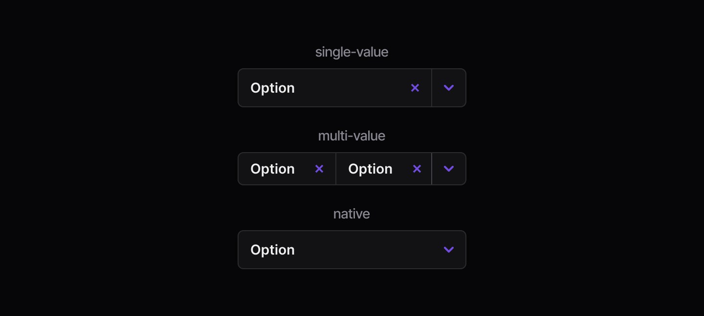
States
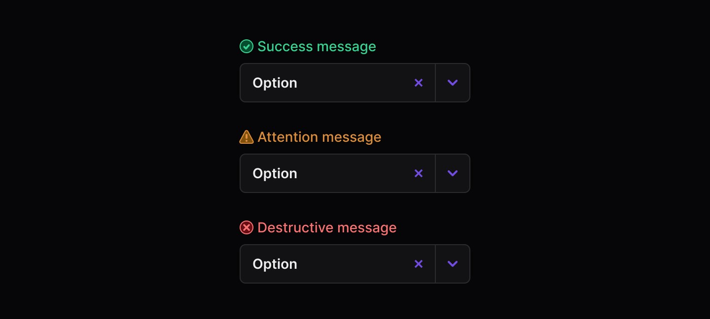
Disabled

When to use | When not to use |
|---|---|
✅ Use to let users choose a single option from a menu | ⛔️ Use a Select when there are fewer than two options |
✅ Use when there are more than six options available | ⛔️ Try not to use vague placeholder text like “Select” without clear context. |
✅ Use when the number of options is variable or unknown | ⛔️ Use Selects for binary decisions such as Yes/No, radios or toggles are clearer |
Anatomy
Element | Description |
|---|---|
| Select title |
| Clear text button |
| Trigger select button |
Variants
States
Disabled
Continue reading
Get in touch
Got a project in mind? Let’s chat. I’m always keen to hear about new ideas, collaborations, or challenges you’re looking to solve. Drop me a message and we can explore how to bring your vision to life together.
Get in touch
Got a project in mind? Let’s chat. I’m always keen to hear about new ideas, collaborations, or challenges you’re looking to solve. Drop me a message and we can explore how to bring your vision to life together.
Get in touch
Got a project in mind? Let’s chat. I’m always keen to hear about new ideas, collaborations, or challenges you’re looking to solve. Drop me a message and we can explore how to bring your vision to life together.